designbybharati

Overview
My role
Problem
The Process
Empathize
Define
Ideate
Test
Design iteration
Conclusion
Design polishing
Style guide
Reflection
FinEase is a Mobile app that provides a secure, convenient, and efficient solution for users to make transactions without the need for physical cash or cards. It enables users to perform various transactions with ease, including spending, requesting, and splitting bills with friends and family.
I worked on this project as a UX/UI designer for the entire design process including research, competitive analysis, user survey, user interviews, personas, wireframing, prototyping, usability testing, style guide and much more.
The users seek a comprehensive solution to manage their payments, pay contactless, and transfer money without relying on credit cards or physical banks. They value the security and convenience of a single application that can handle multiple bank and credit card transactions.
we will know this to be true when we see users using the app to manage their payment and finances as we a high rate of user retention, indicating their ongoing satisfaction with the product and its services.
I applied the design thinking process to my project, and it allowed me to explore and define a problem. The methodology offers a solution-based approach to solving problems, with a user-centered approach.

Possible Problem
Possible Solutions
-
Users have difficulty completing a task because of their unclear navigation and interface design.
-
User has concerns about the security of the app and if their information is protected.
-
Complicated and not engaging payment process that frustrates the user.
-
User has difficulty following the overview of their transactions.
-
The user desires extra features such as budgeting and split bill functions
-
The navigation and interface should be simple and clear to reduce and prevent possible mistakes.
-
The app must offer two authentification options encrypted enough to secure the account's information.
-
The app must provide users with a tracking feature. this will encourage the user to manage his budget accordingly.
-
The app should encourage and support users with rewarding and split bill features.
Competitive analysis
N26
Overview - N26 is a digital bank that offers banking services, including a checking account, debit card, and various money management tools, all accessible through a mobile app.
Key objectives -It provides a seamless and convenient banking experience for its customers through its mobile-first approach. They aim to make banking more accessible, user-friendly, and modern, by providing a range of features such as real-time account management, easy money transfers, contactless payments, and a high level of security for customers’ financial information and transactions. Overall, N26's objective is to simplify banking for its customers, making it more aligned with their fast-paced, digital lives.
Problem Statement
The users seek a comprehensive solution to manage their payments, pay contactless, and transfer money without relying on credit cards or physical banks. They value the security and convenience of a single application that can handle multiple bank and credit card transactions.
we will know this to be true when we see users using the app to manage their payment and finances as we a high rate of user retention, indicating their ongoing satisfaction with the product and its services.
Commerzbank
Overview - The Commerzbank app is the mobile banking app offered by Commerzbank AG. The app allows users to manage their accounts, view transactions, transfer money, pay bills, and perform other banking activities on the go. Users can also access financial information and investment products through the app.
Key objectives -Provide customers with a convenient and easy-to-use mobile banking solution that allows them to perform banking activities anytime, anywhere. Deliver a seamless and intuitive user experience that enables customers to perform their banking activities with ease. Continuously improve the app and introduce new features and services that meet the evolving needs of its customers.


User survey:


Survey Finding:
-
Most people want their information is secure while shopping online
-
70% of my survey participants were 25-40 years old, which is right in the middle of my target age for my audience
-
Participants like the recurring payment feature but they don’t often use it.
-
Participants rarely budget
-
Most participants use the app weekly and monthly while shopping, sending money to friends, and making bank transactions
User Interview:
Based on the results of the interviews, I organized all data in an affinity map and divided them into categories.

Findings:
-
Payment between users using only one app
-
Fast payment between users
-
Users always go with friends and use the splitting bill feature they don’t find this option in an app
-
The app needs to be simple and clear that is easy to use and intuitive
User personas
User persona is fictional character, which are created based on research and data collected from user and stakeholder interviews, surveys and other sources of information. It help to better understand user’s needs, pain points, goals and behavior. I created 2 personas that could represent a hypothetical part of my target audience.


User Journey map
To better understand the point of view of the users I created this user journey map to show users needs
and pain points. Here is to highlight the path that the user take or reach their goal when using the platform.


User flow
To show the steps that the user take to reach their goal I detailed User flows. Here appears the user’s movements through the product, from the entry point until the final step the success criteria.


Card Sorting
There were a total 31 cards that I had created for card sorting to get the opinions on how the users would like to categorize them and which type of heading would they prefer to see in the application.

Sitemap

Low-fidelity wireframe
On paper I did sketches of the screens of my prototype showing the steps to send money to friend.


Mid-fidelity wireframe
I used Figma to translate the sketches into a computer design to produce the potential user interface for the product.

Usability Testing
The aim is to assess the user experience and pinpoint aspects that require improvement. Finding and fixing any issues or problems that users may have with the app—like poor navigation or an unintuitive interface—and enhancing the overall user experience are the ultimate goals.
Test objectives
-
learn about the user's experience navigating the app and the ease with which they can finish a task.
-
Get user input on the app's visual design, iteration design, and UX writing.
-
Determine user's pain points and struggles using the app
-
identify the mistakes, the ease with which users can fix them, and the ultimate source of their mistakes.
-
How easy and enjoyable is the overall use of the app
Methodology
I conducted remote and in-person moderated usability tests with six participants.

Usability Testing
There were six remote usability evaluations performed. All six participants agreed that the prototype's navigation was easy to use after successfully completing the tasks. I was able to determine the primary problems and mistakes that the participants encountered during the testing by utilizing the rainbow spreadsheet to analyze the data. I prioritized the problems with the highest error rates in order to further enhance the prototype.
1.Typos and spelling errors
Severity: High
We understand that typos and grammatical problems can have a significant negative influence on how the product is viewed, even though only one participant brought up spelling errors. Therefore, in the following iteration, fixing the spelling error will be assigned top priority.
2. Add amount
Severity: High
The add amount option on the transfer money screen is not user-friendly and clear, which is the problem. and the resolution is that a large area was made to add the amount.


3. create a group on the split screen
Severity: Medium
Users found it difficult to comprehend the group creation and filtering options. They don't know where to start or how to organize a group. so I figured out a way to eliminate both options from this page and add a member to the contact so that the user could quickly receive reviews.


4. Misleading word/CTA “Receive”
Severity: High
I had to reconsider and rename the feature because one of the participants didn't understand what the word "request" meant. I chose to rename it "receive" in order to better connect it with the feature's intended use after receiving additional open-ended queries.


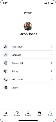
5. The profile page and the user profile icon are not linked.
Severity: Medium
I will update and correct the connection mistake on prototyping right away, as it is a technical prototyping error.
The participants had a good overall experience with FinEase and said it was simple to use. Every work was effortlessly done by them all. Some participants reported that FinEase was easier to use because the navigation was similar to other apps they regularly use.
In addition to improving the input gained through user testing, I was able to significantly enhance my designs by implementing the next steps.
Grids & spacing
every of the screens for my mobile apps now have a four-column grid structure, and every element spacing has been adjusted to follow the grid and enhance the design and alignment.
Peer feedback
I worked with other Careerfoundry Slack members and requested their opinions on my concepts. It resulted in the addition of labels to displays and a change of font sizes and weights to provide a clearer design.
I created a full set of design style guidelines including typography, colors, UI elements and icons and more.

Future steps
-
To improve the app's general engagement level, I'm thinking about adding more interactive elements to the design.
-
In order to provide an enjoyable user experience, I also want to develop the desktop version by designing every interface and running usability tests.
Lesson learned
This project has been exciting, rewarding, and challenging to work on. I now see how crucial it is to comprehend the needs, behaviors, and main issues of the user before beginning any design work. Additionally, I've learned the value of user testing and how important it is to gather input in order to guarantee a user-friendly design. Along with learning how to properly present my design work and explain my design ideas, I also learned about the processes involved in designing the user interface, such as wireframing and prototyping.
Furthermore, I gained knowledge of the difficulties faced and how they were resolved during the design process, including finding a balance between the demands of users and business objectives, designing for accessibility, and ultimately learning to accept feedback in general.
All in all, I gained insightful knowledge about how to satisfy user needs and create an enjoyable user experience through design.